Bringing software quality into roadmaps
“We really struggle to bring engineering topics into the roadmap! When do we finally get the time to improve our code quality?” Many software development teams gripe when it comes to getting engineering topics into a product roadmap. For many, improving the lesser visible aspects of software quality comes second putting more features into a product. Nevertheless, creating quality software is a necessity if products are expected to perform on the market and be developed for a long time. The ISO 25010 model for software quality lays a good foundation to discuss the quality topic with the relevant stakeholders and with a few easy-to-learn tools putting features that improve the quality into a backlog becomes much easier.
Most of the time it is not that the business-facing people in software development such as POs, marketing, sales and so on are not interested in having a quality product at their hand. The reason why work regarding the internal quality of a piece of software is pushed to the back of the backlog, is often that we engineers are very badly prepared to hold a constructive dialog on software quality with people with a less technical focus.
The most common problem is that teams struggle to define software quality in the first place and just refer to any of the work on improving a codebase as “refactoring” or “working on tech debt”. While the developers might have a quite clear idea of what these terms mean, they often do not serve well when talking with non-technical people. Agile software engineering is often very value driven, so one cannot argue the value of a task during planning it will consequently be deprioritized. If developers want to bring software quality topics into the planning discussions, they have to change how to talk about it and how to present the information to justify why it is necessary.
Defining Quality
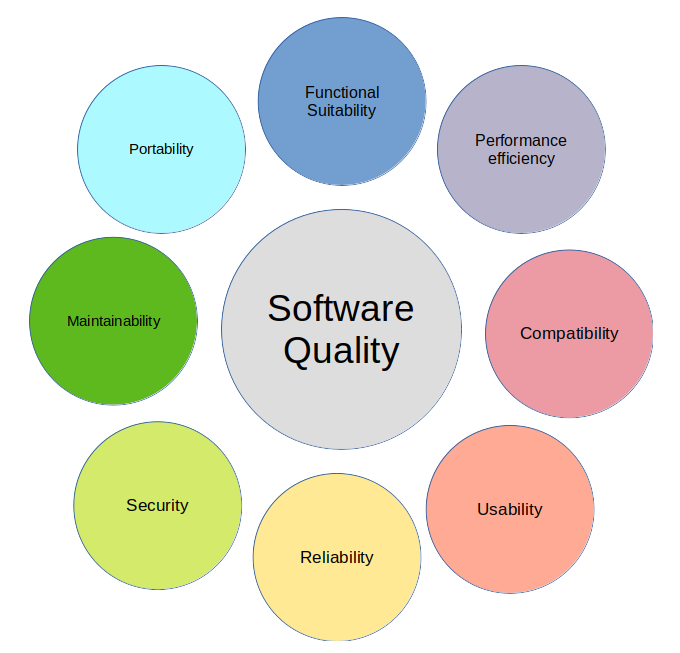
Let’s start by describing what software quality means by using the ISO 25010 model for software product quality. The ISO 25010 standard lists eight characteristics of software quality and combined they give a very comprehensible definition of what software quality entails.
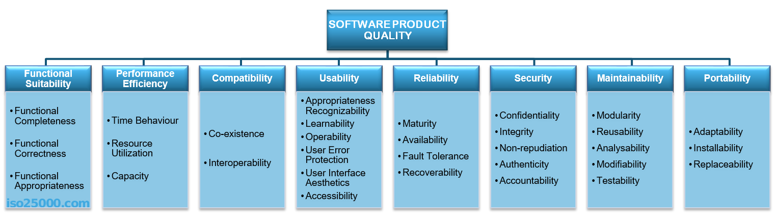
in a nutshell, the eight characteristics are:
- Functional Suitability - How well does the product meet the stated and implied needs?
- Performance efficiency - How effectively does the product use the available resources?
- Compatibility - To what degree can the system interact or exchange information with other products and systems?
- Usability - How satisfactory and effective and efficient are the users when using the product?
- Reliability - How well does the system perform its function under specific conditions?
- Security - How well are the system and the data within the system protected against unauthorized access?
- Maintainability - How effective and efficient can the system be changed or developed further?
- Portability - How easy can the product be transferred to different hardware or run-time environment?
A more comprehensive description of each category is available on the ISO 25010 homepage.
Defining and understanding the quality metrics is the very first step towards getting an actionable plan on where and how to improve quality in a software system. As this is an international standard that naturally is intended for a very broad audience, these characteristics might lack context, so there might be a bit of work to do to define what the characteristics entail for a specific product. So, one of the first things to do is to gather everyone involved with developing a product and find alignment on the understanding of the various quality characteristics, possibly by gathering everyone and having someone present the ISO standard.
Assessing Quality from an Engineering Perspective
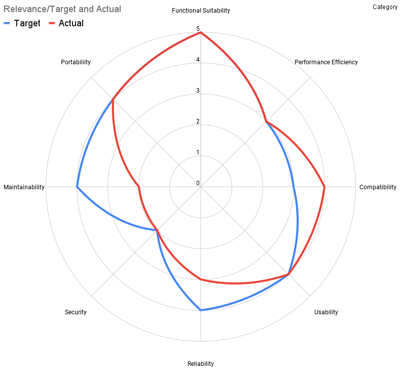
Once an team has defined and communicated what is meant by “software quality”, creating a quality assessment and quality goals of the current software is the next step. A simple gap analysis can be done by having the developers draw a spider graph of where they think their software currently is and set the goal values of where they would like to be. For a first iteration, this can be done on gut feeling if people know the code reasonably enough. Later you might want to find and agree on a more data-driven metric such as the number of bugs reported. Either way, one of the most important things to do is to set the scale of the spider graph and agree on what each number means.
An example scale could look like this.
| Scale | Overall Score | Frequency of reported issues of medium or higher severity | number of known defects | impact of issues on users |
|---|---|---|---|---|
| 1 | Bad, not satisfactory at all | Daily/Weekly | large | Work cannot be performed |
| 2 | Not satisfactory | Weekly | few | Work is severly impeded |
| 3 | OK | Monthly | almost none | work is inconvient |
| 4 | Good | Quarterly | none | temporary inconvenience |
| 5 | Excellent | Half-Yearly | none | Users might not notice |
Once the scale is established, drawing a spider graph of how the characteristics are rated as well with an expected goal value or relevance for the product helps to visualize the current state and gap for each characteristic. It might be tempting to put all goal values to the maximum value, so a good approach is to weigh the goal values also by relevance. An embedded system without any user interface might have a low relevance and thus a lower goal value in the usability category. Or software running in a very isolated environment might put the compatibility or portability to a very low number while putting reliability to the max. If it is still hard to find reasonable goal values, it can help to place the goal number at the value that we want to achieve with the next product increment instead of an overall goal value.
The gap analysis from an engineering perspective is a good starting point for engineers for discussing which items regarding improving quality should go into a prioritized backlog. However, getting the business side of the product development into the loop requires a different approach as they will probably find it hard to assess some of the more internal quality aspects of the product. For this the building a preference matrix is a very suitable tool.
Defining the Relevance of Quality
The preference matrix compares each quality characteristic against all others to find out which one is currently valued the most. As opposed to the gap analysis, which defines targets from the current state, the preference matrix is focused on defining the desired outcome first and then working backward to the current state. This often suits the non-technical people involved in a product better. Additionally, the quality assessments done by the devs might yield several areas where teams would like to invest work. In this case the preference matrix might also help with prioritization.
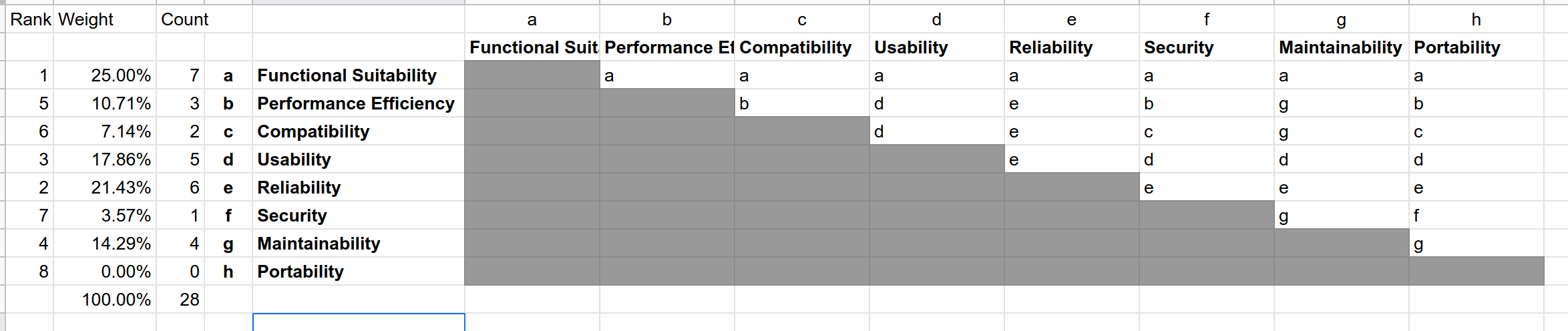
To fill out the matrix go through it from the top left to the bottom right, asking for each combination of the quality categories: “If you have to choose, would you rather invest into “A” or “B” in the next product increment?” Note down the one that gets mentioned and continue. The people have to pick one, as we want to eliminate as much ambiguity as possible - “both” is not an acceptable answer here. Once the combinations are filled out, the number of mentions of each category is counted and divided by the total sum of all combinations to get a percentage value (there are 28 combinations if nothing was added to the IS25010). The higher the percentage, the more important a quality characteristic is. In most cases, one or two categories will be the top contenders, so this is where teams should prioritize the work. Now is also a good way to crosscheck the ranking against the gap analysis done by the engineer. If the priorities according to the preference matrix are very different from where the engineers see the gaps, this needs a conversation to be resolved, but most of the time there is some overlap. A very simple and pragmatic resolution is might be the agreement that in the next iteration the category with the biggest gap from the gap analysis might be placed on the same priority as the characteristic that scored the highest on the preference matrix.
The last and final step to getting work that benefits the product quality the most into the roadmap is mapping any planned backlog item to the preference matrix.
Mapping Quality Characteristics to Features and Epics
To find out which feature or backlog item pays for which metric, I like doing a stripped-down version of the Quality Function Deployment (QFD) method. This method assesses the influence of each feature on each quality metric. Those features that influence the quality characteristics that got the highest scores in the preference matrix and the gap analysis are prioritized first.
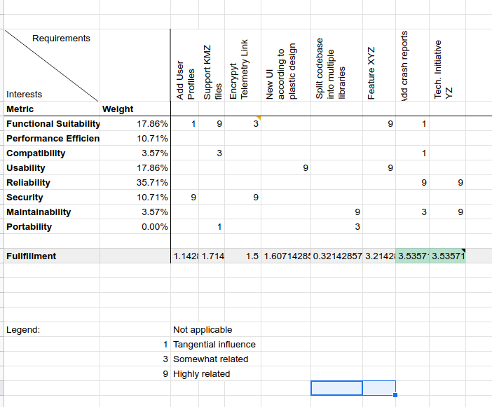
On the left side of the table, all quality metrics are listed with the weight from the preference matrix. On the top, all high-level features on the backlog are listed. For each feature, it is determined if it influences the quality metric. For features that have a very clear effect put in a 9, for features that have some effect put in a 3 and if the feature has a very minimal effect put in a 1. If there will be no effect, leave the cell blank. This scale is chosen like this on purpose, as we want to prioritize the things that have a very distinct effect first.
The bottom line shows how much each feature fulfills our preferred quality. Each of the numbers is multiplied by the weight of the category and then each column is summarized. The features with the highest fulfillment rate are the ones that should be prioritized highest.
Quality Evolves
As with any aspect of a product, the quality will change over time. Some aspects might degrade because of the complexity added but more often there is an inflation in the values added. As products evolve, users get used to a certain quality and expect higher standards, which means that what was perceived as sufficient or high quality might suddenly be perceived as shabby. Security is a prime example of this: A few years ago it was rare to have two-factor authentication for an online service, while nowadays it is becoming more and more a standard up to the point where people will not use a service if there is no 2FA present. So the quality assessment and preference matrix have to be adjusted every other planning cycle.
Once the quality assessment and preference matrix are there, mapping of the larger efforts in the backlog to the quality characteristics should become standard practice when planning. As with a lot of things, doing it the first time will take some time, but if done repeatedly teams usually get very efficient at processing and using the information and will get a lot of value out of this additional aspect of planning.